 What to expect in terms of web design trends in 2012? Technology is always changing and probably never in history had it been so quick and fast paced. With emergence of new technologies web designers and developers must adopt their design and development techniques to keep pace with them. In 2011 we saw large, oversized banners, minimalist designs, custom, web friendly typefaces, big footers with lots of links and text, integration of social networking in websites trending. What will 2012 bring for us and what should the web designers be prepared for? Here are our takes on three major trends we think will gain momentum this year:
Responsive web designs:
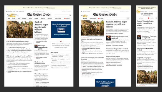
As of now, over 70% of the world population owns a mobile device and at least 85% of the mobile devices sold in year 2011 came with a web browser installed. Browsing internet using mobile devices has been on the rise for last couple of years and the trend will continue keeping up not down. The future will see a gradual decrease in Desktop and Laptop usages and mobile devices will dominate. Websites must face the challenge of displaying contents in large desktop screens and small screens of mobile devices alike. Up until 2011, the best solution was to create different versions of websites for different mobile devices. One website version for desktop users, one for iphone, smart phones etc. and even another version for ipads, galaxy tabs etc. But this is very cumbersome and not to mention costly and time-consuming to develop and maintain. Responsive web designs are the latest and most viable solution to this costly nightmare. The term “responsive web design” can be most simply explained as the concept of designing and developing a website so the layout responds to and gets changed according to a user’s mobile device’s or computer’s screen resolution. It enables the users to avail an advanced 4 column lay out, with the width of 1292 pixels, on a 1025 pixel width screen, that auto simplifies into 2 columns.

The concept was first introduced by Ethan Marcotte on his article “Responsive Web Design” for A List Apart. Responsive web designs are also future proof for emerging new devices. The theory behind responsive, flexible web design involves clever utilization of several grid and layout systems, CSS media queries and image optimization with Javascript plus CSS and therefore, no matter how many different devices are released in the future, responsive websites will always be able to provide a proper response to the device requests. Responsive web designs will slowly become the norm in the upcoming years.
User centric web designs:
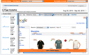
Making your website design user centric should always be the main focus. It is not enough to just bring a lot of people to your website. You have to engage them so they spend a lot of time on your website as well as come back repeatedly. If you have any intention of getting profiting from the traffic and has some kind of conversion of users to consumers in mind, it is all the more important. In 2012 the focus and effort should be doubled and tripled. One of the pressing reasons should be the Search Engines becoming smarter. A lot smarter than the days when they used to just crawl pages in UNIX text browser style and index only your text and rank your pages high on their results based on how many times a keyword text appear on your web page. No Sir. The search engines these days behave like Headless Browsers. They can execute JavaScipt, Ajax post actions, crawl Full Flash websites. They take into account how much time a user stays on your website, how many pages they have viewed, the bounce rates, which parts of your web page layout are most frequently clicked etc.  If you are using the new version of Google Analytics look under Content->In-page Analytics for a compelling evidence. SEOmoz has a great article on this. Web designers and developers are always becoming increasingly aware of this point and so user centric designs will rule in 2012 to ensure maximum user engagement and stay on the websites.
Death of Flash led by rise of HTML 5 and CSS3:
2012 will see less and less usage of Flash for designing websites, animations and presentations. Usage of html5 and CSS3 for animation will replace Flash as these are supported by iphones and ipads to a great degree. Though html5 was first introduced in 2009 and is still under development to subsume not only HTML 4, but XHTML 1 and DOM Level 2 HTML as well, most latest browsers already support them to a great degree; specifically Firefox and Google Chrome. HTML5 supports new elements like article, aside, audio, bdo, canvas, command, datalist, details, embed, figcaption, figure, footer, header, hgroup, keygen, mark, meter, nav, output, progress, rp, rt, ruby, section, source, summary, time, video, wbr. These will make creating interactive websites without the need for using Flash for animation or other objects and plug in much much easier. Adobe too realised that Flash was unlikely to continue its long standing market share in the future; with the increasing importance of site-speed, lack of iphone/ipad compatibility and YouTube’s shift towards HTML5. As a consequence, Adobe made the move to lose some of its Flash development staff and shift their focus towards HTML5.
 HTML5 adds many new syntactical features. These include the
 <video>, <audio>, <header> and <canvas> elements, as well as the integration of SVG content that replaces the uses of generic <object> tags. These features are designed to make it easy to include and handle multimedia and graphical content on the web without having to resort to proprietary plugins and APIs. Other new elements, such as <section>, <article>, <header> and <nav>, are designed to enrich the semantic content of documents. New attributes have been introduced for the same purpose, while some elements and attributes have been removed. Some elements, such as <a>, <cite> and <menu> have been changed, redefined or standardized. The APIs and document object model (DOM) are no longer afterthoughts, but are fundamental parts of the HTML5 specification
Also deprecated elements like acronym, applet, basefont, big, center, dir, font, frame, frameset, isindex, noframes, strike, tt will be be dropped altogether. So, designers will be forced to use the latest standard so their websites look properly on major browsers. According to a report released on 30 September 2011, 34 of the world’s top 100 websites were using HTML5. The quick and strong adaptation of html5 and CSS3 is led by search engines and social network sites alike.
So, what do you think will trend in 2012? Post your thoughts and comments below.


Leave a Reply